Promotional
Publications & Marketing Material Creation
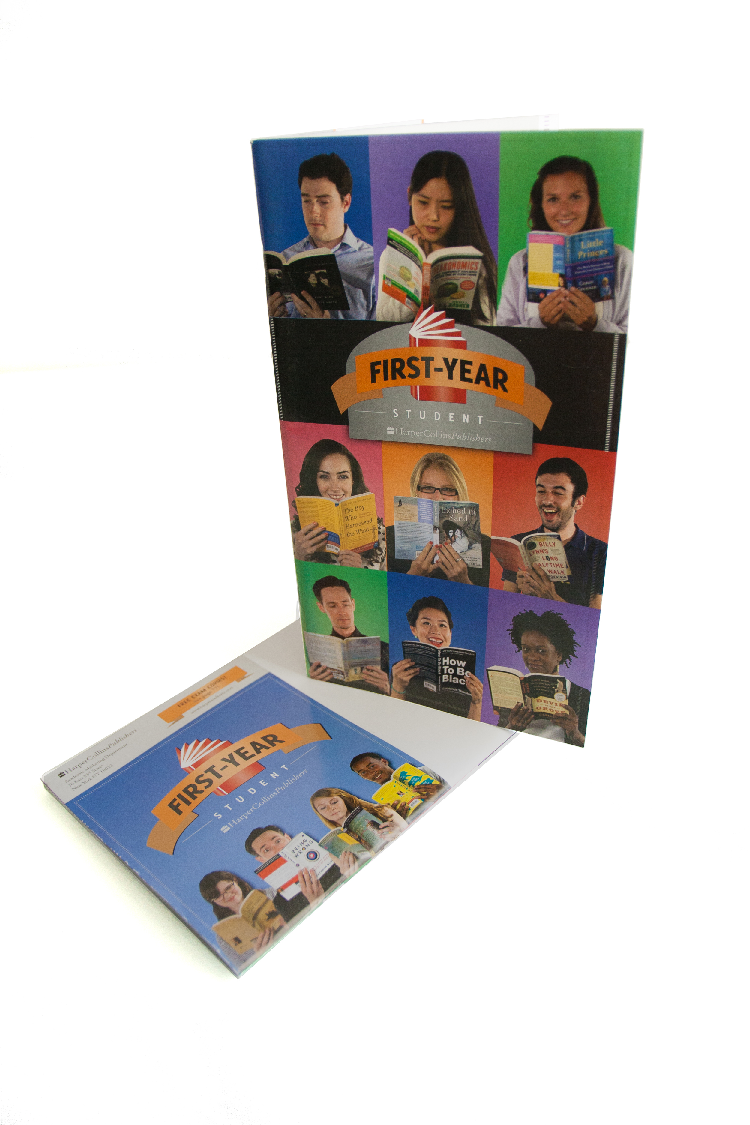
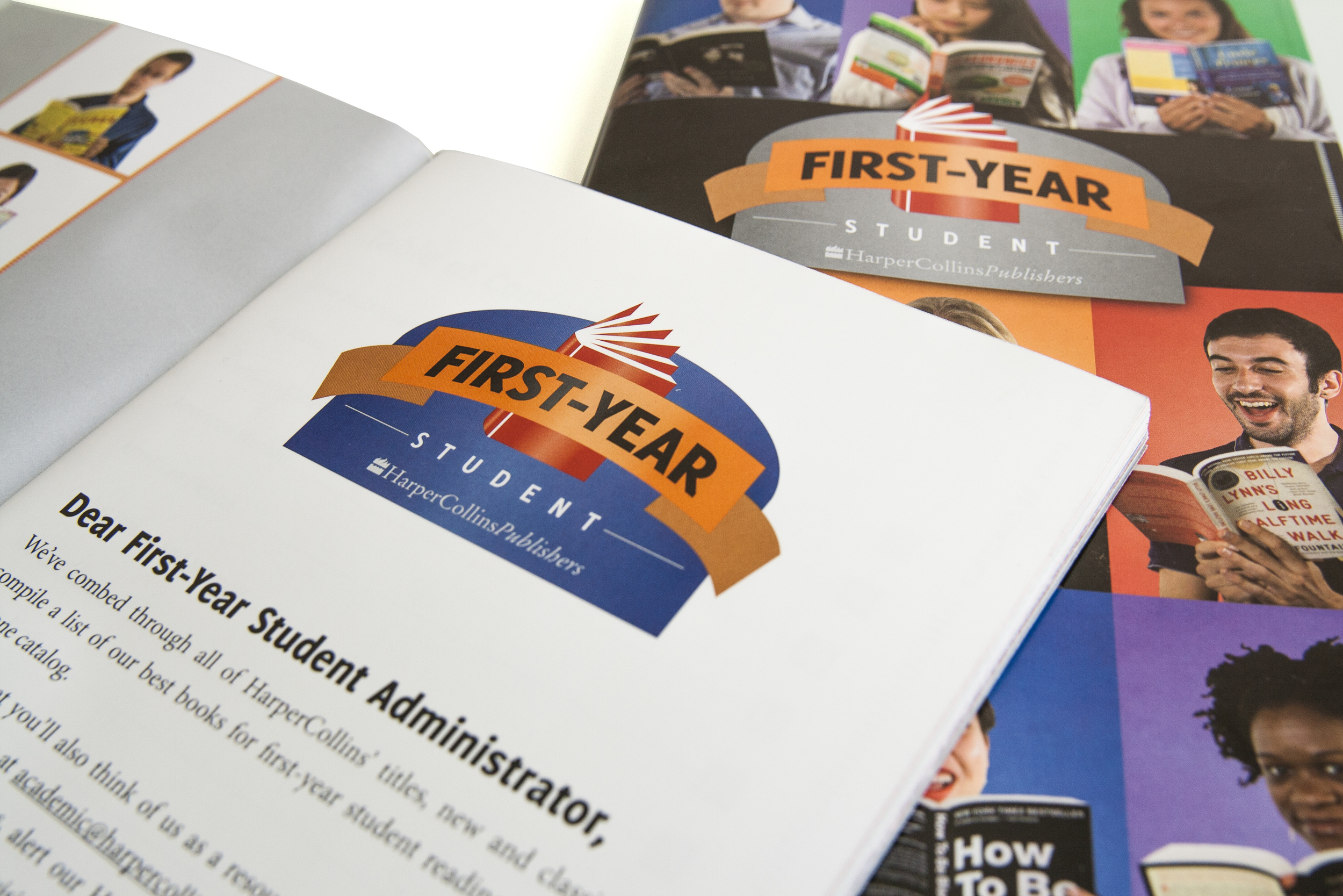
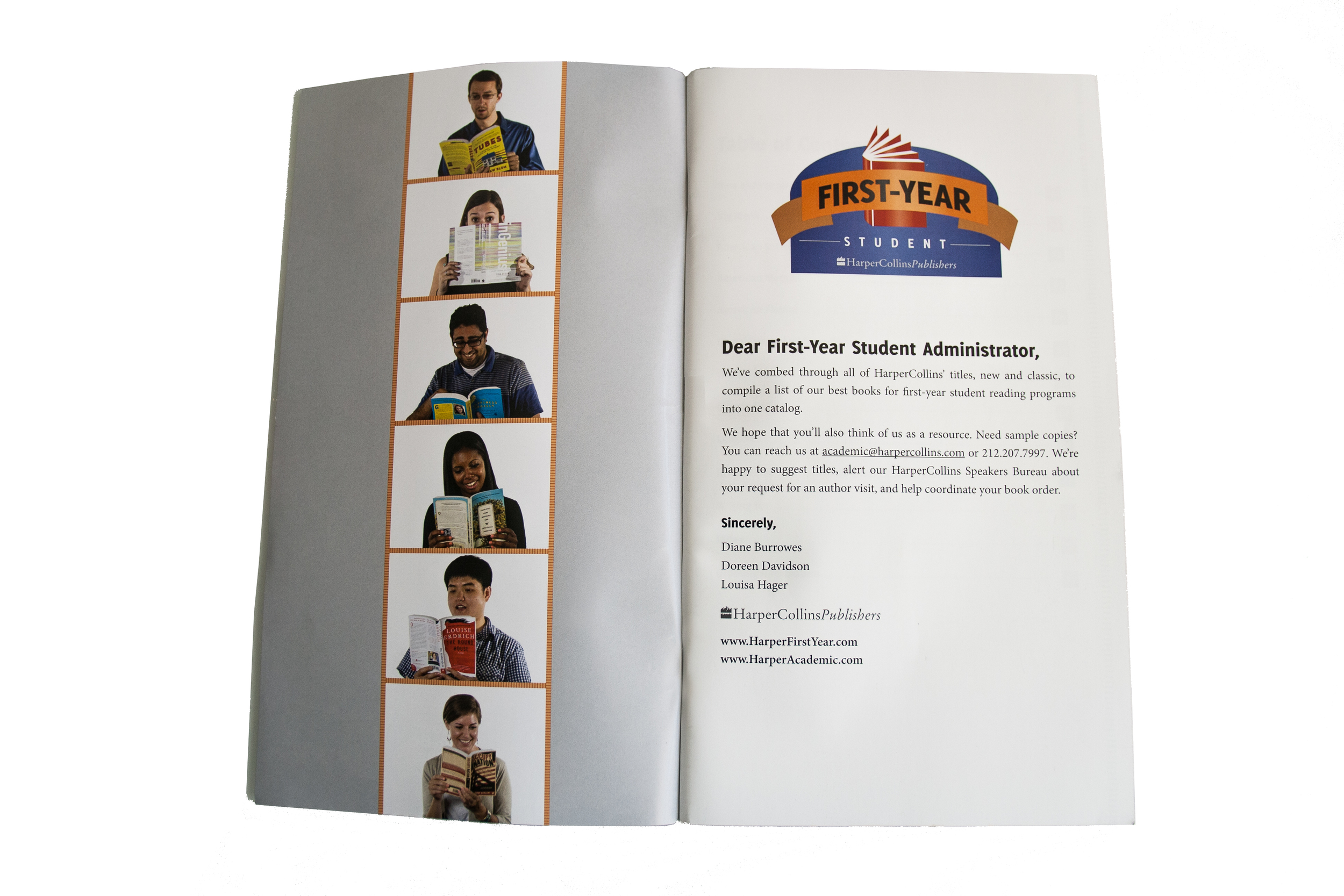
First-Year Student Catalog
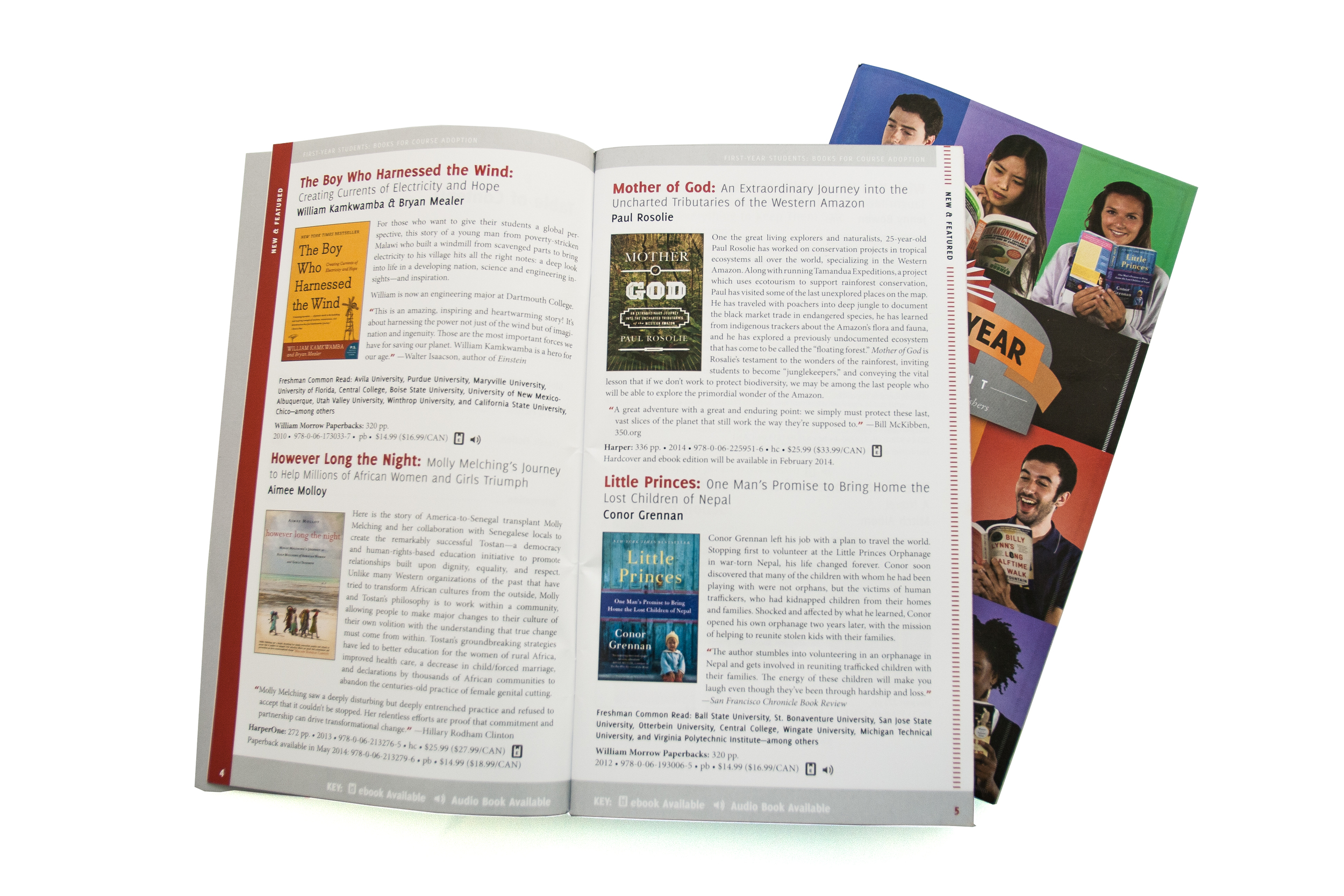
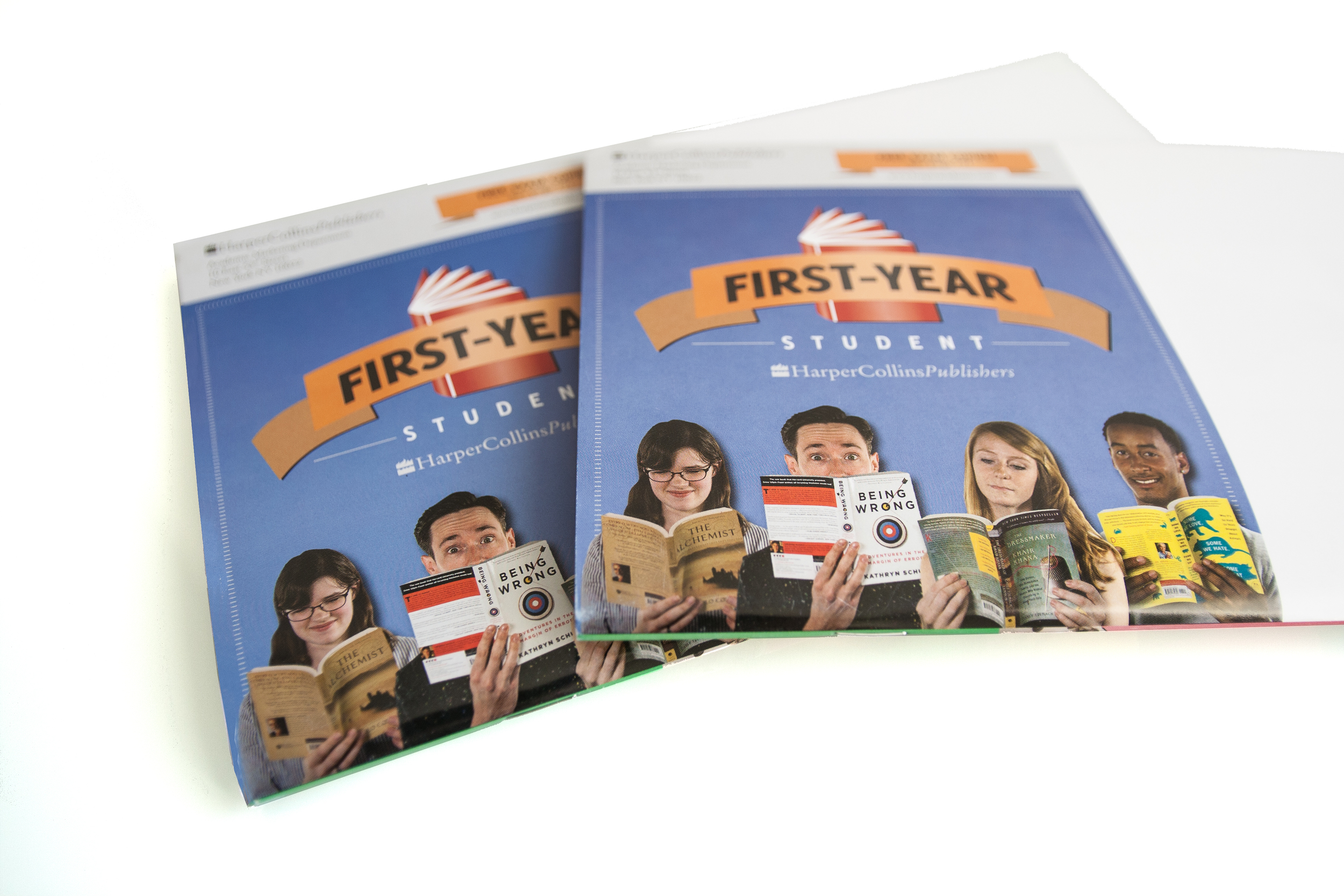
HarperCollins' Library and Academic Marketing department works closely with colleges that pick and implement "a common book for their entire freshman class (or even the whole campus) to read as way to help students engage with big ideas and issues, each other, their professors, and life on campus" (Diane Burrowes). Each year, a print catalog with hand-selected titles from the HarperCollins print list is produced and distributed through mailings, at conferences, online (digital version also produced), and more. This year's print run was 17,000 copies and the first year produced in full-color for the interiors.
To highlight both the uniqueness of each individual college student as well as the cohesive whole of an entire freshman class, photos were taken of "students" reading one of the selected titles. A bright color-scheme was selected to be fresh and appealing, as well as serving as an organization feature for the interior. A logo was created for use on the catalog cover, in print/digital advertising, and on the website. The total page count is 84 pages, and it also functions as a self-mailer as many were sent bulk-rate.
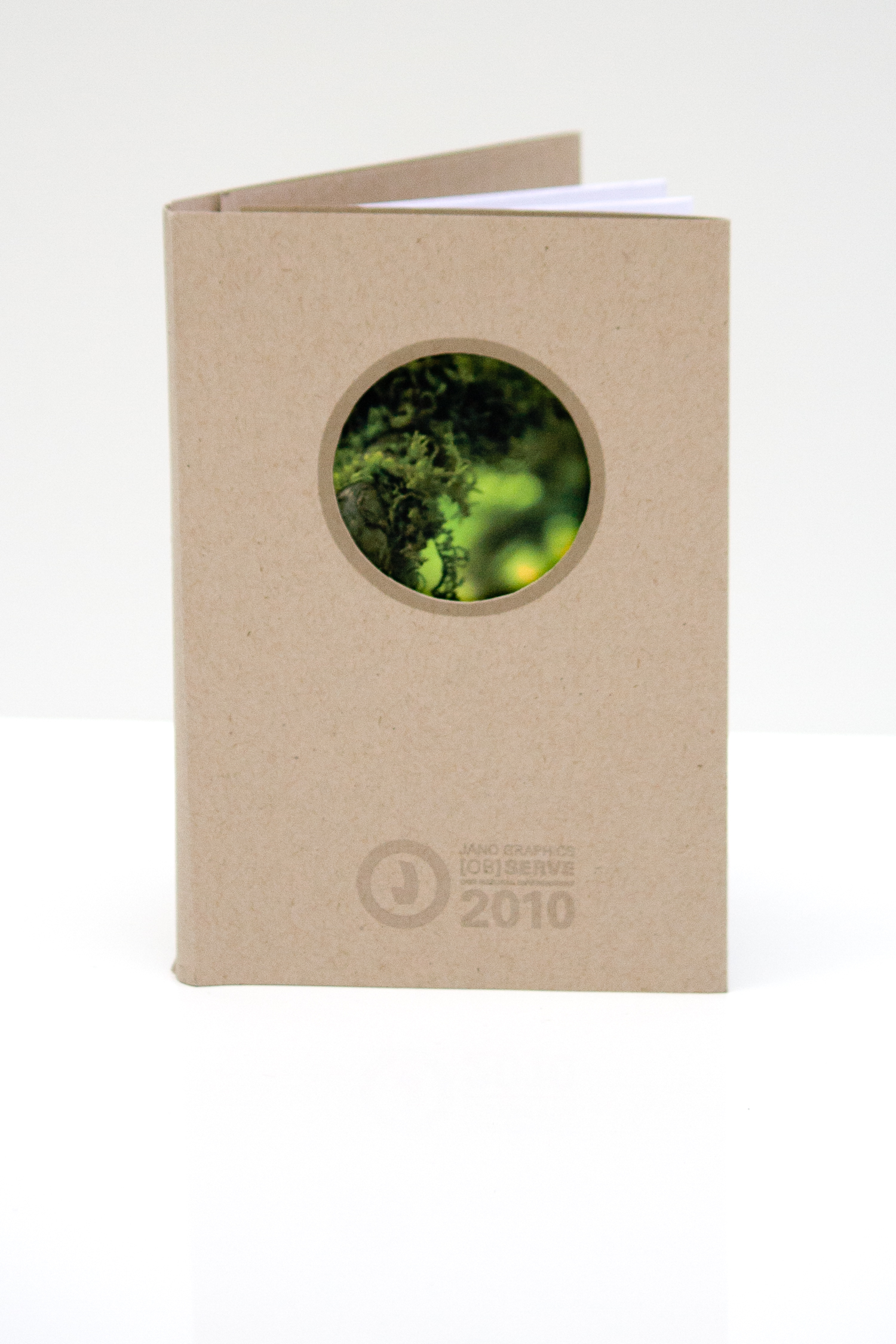
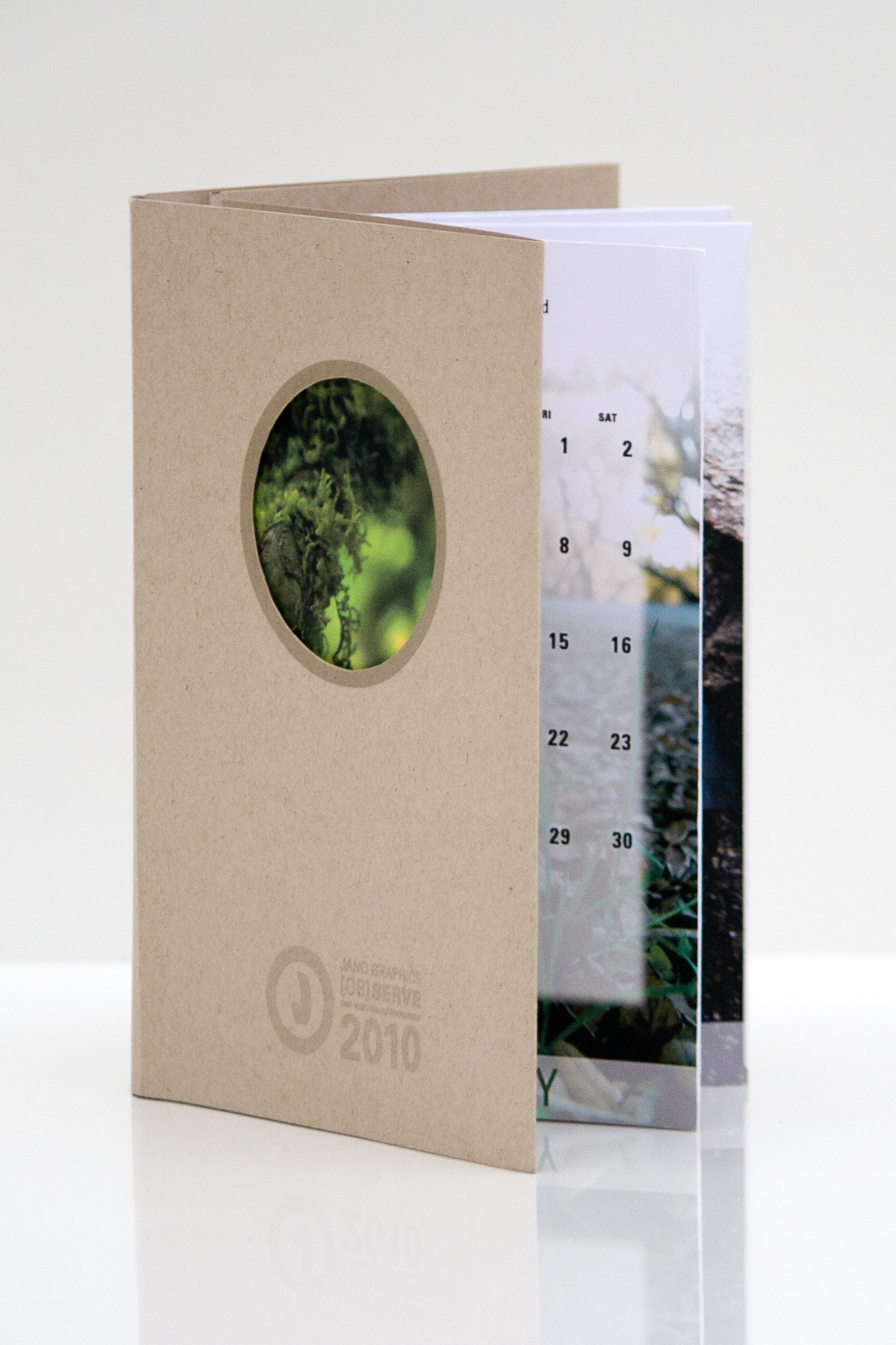
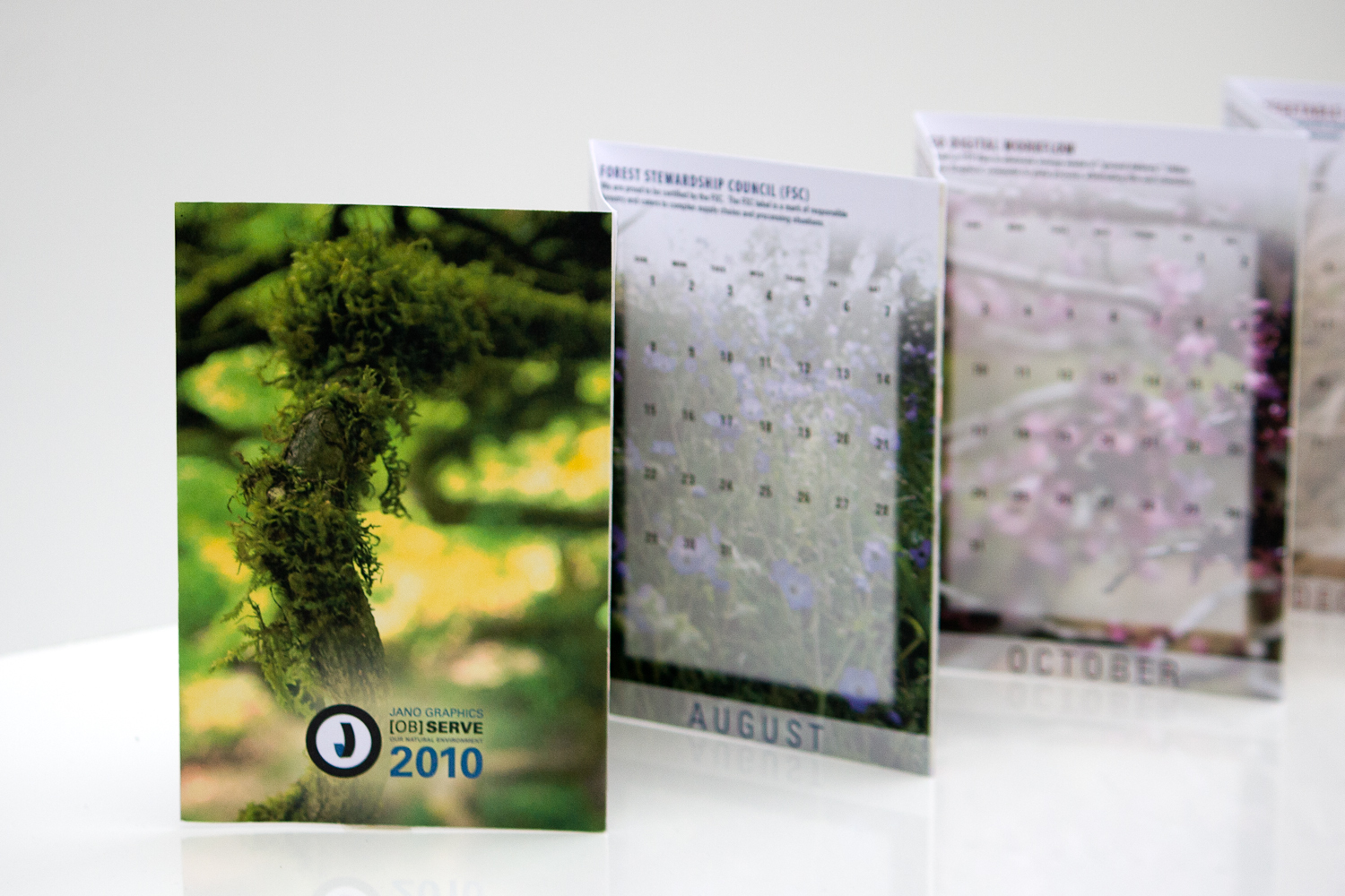
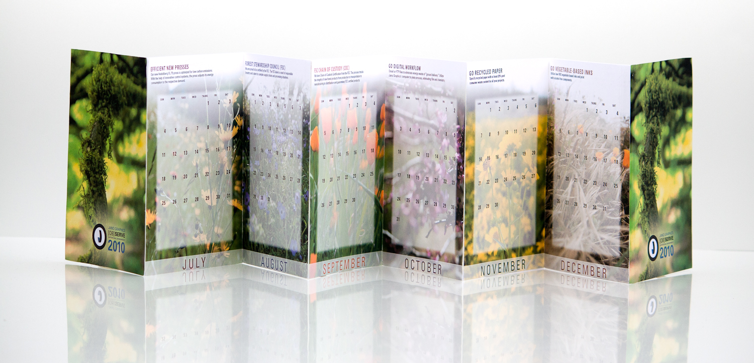
Jano Graphics Promotional Calendar
Jano Graphics, of Ventura, California, desired a 3-D design for their promotional calendar. It was to showcase their printing & finishing capabilities, highlight their sustainability focus, & be functional in form. This used full-color photographs & 100% recycled paper to stay with the theme of [ob]serve the environment. To keep printing costs minimal, this was designed and proposed to be printed on a 54" press sheet, front and back, with an accordion fold. The cover was to be printed separately and be a case-wrap for the calendar, allowing it to function in hand or across a flat surface.
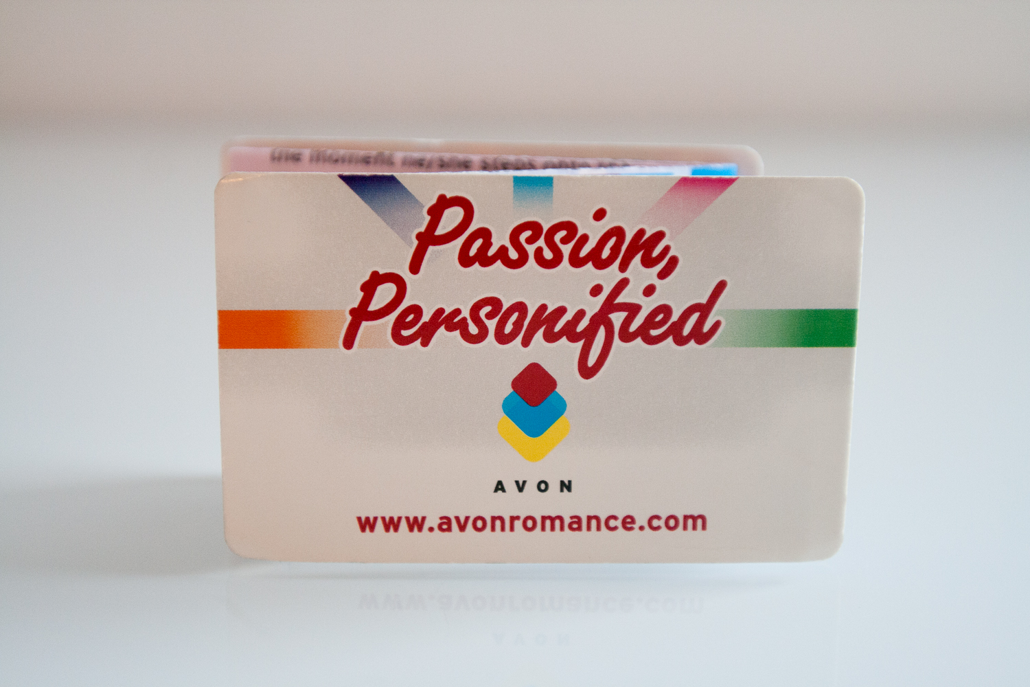
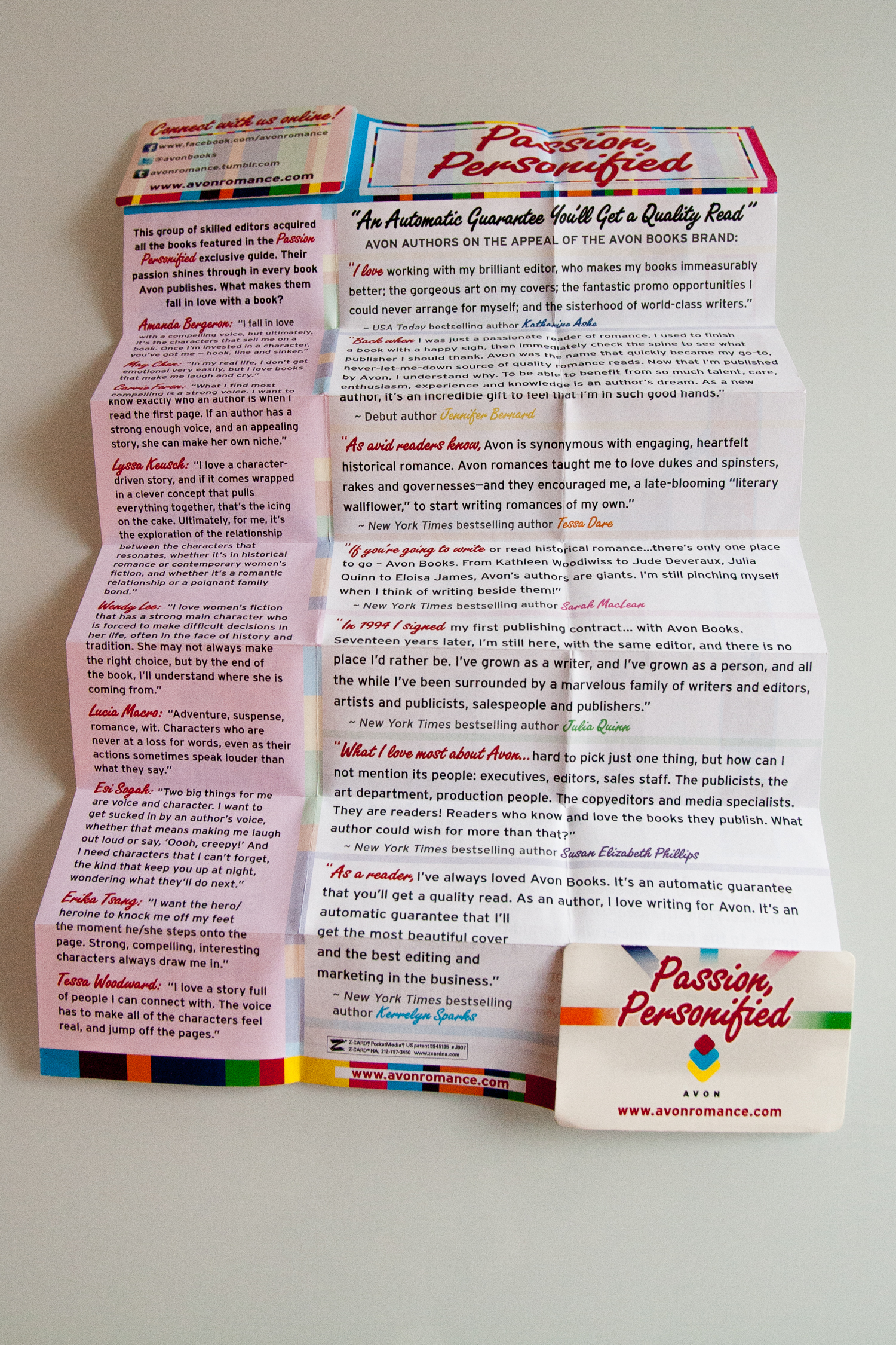
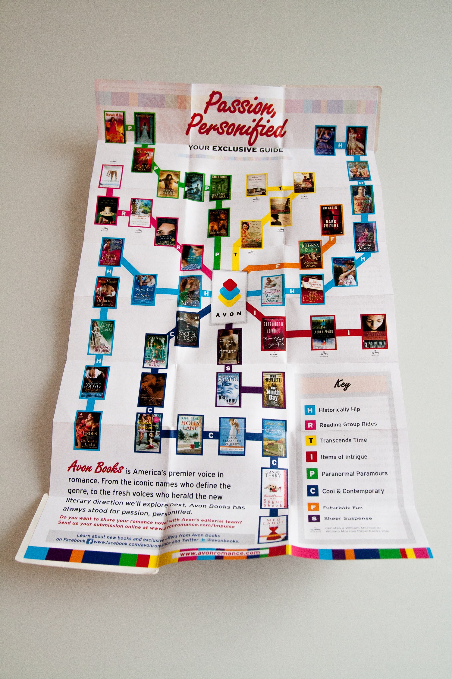
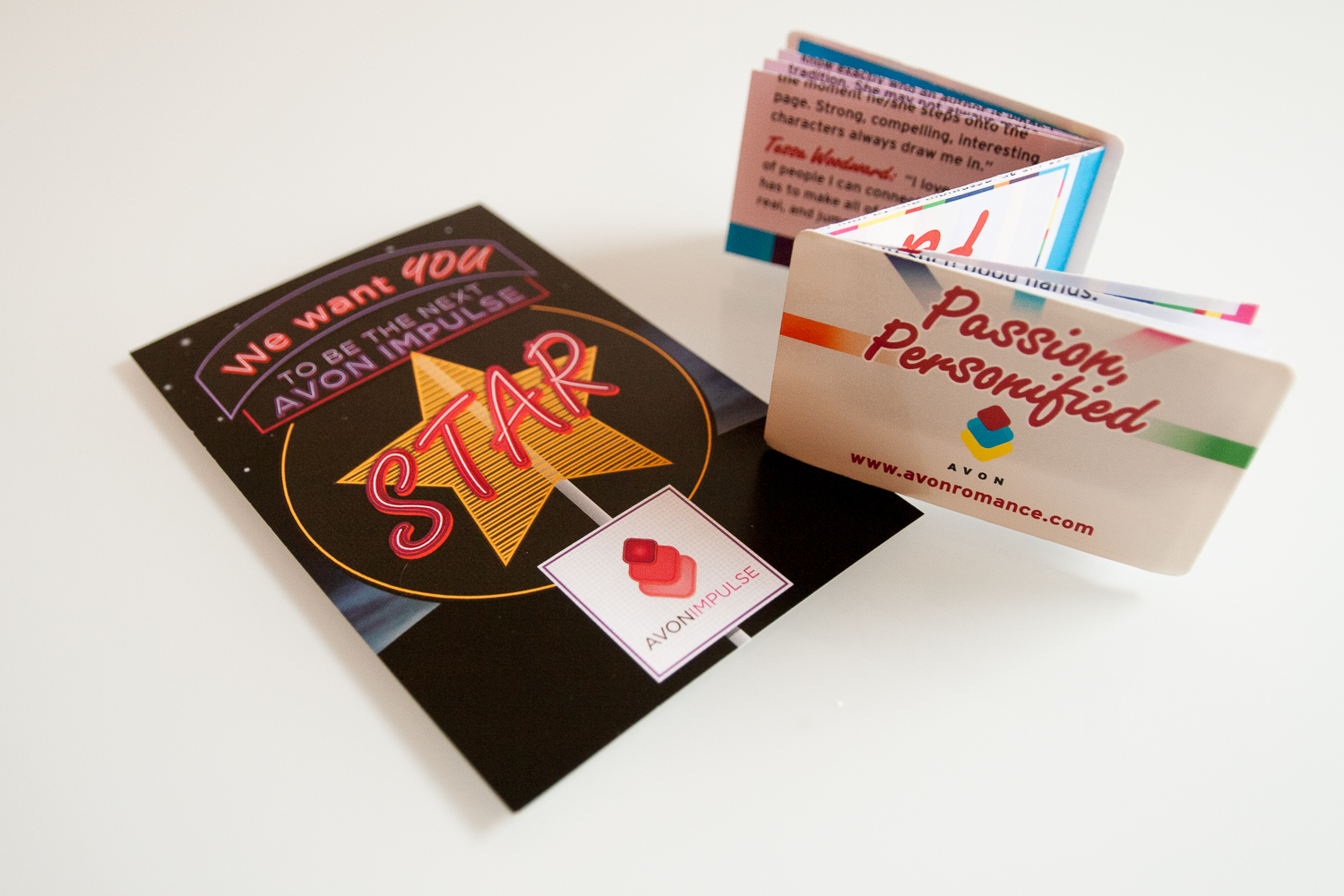
Avon Conference Promotions
Avon Romance is an imprint of HarperCollins Publishers, highly regarded for its editorial talent and bestselling authors. For their conference, they wished to highlight both by organizing their books into genres, as well as stating what editors are looking for in original submissions. This custom "subway" map uses the theme of Passion Personified, where a balance had to be struck between the traditional romance style and the growing contemporary style it is also becoming known for today.
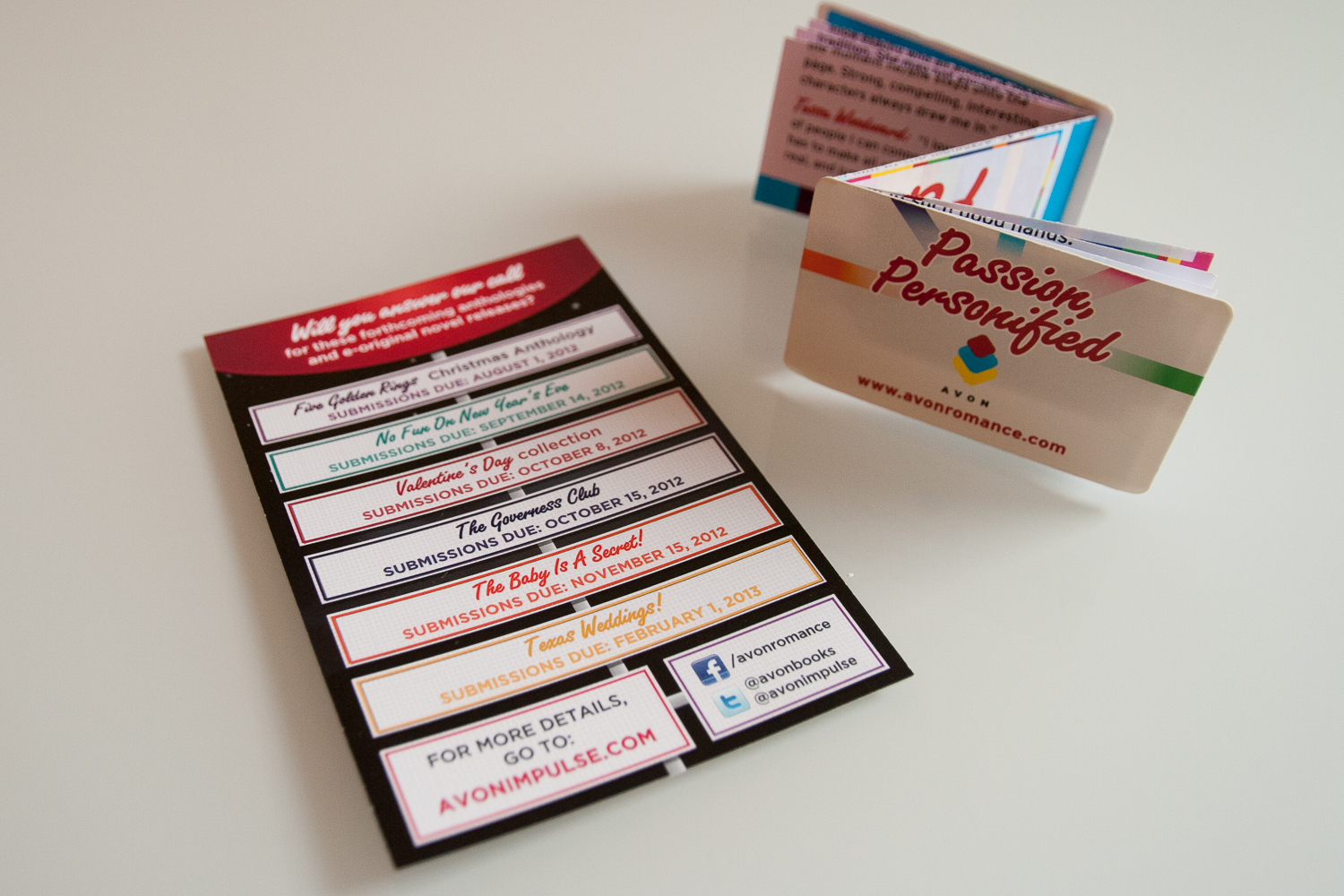
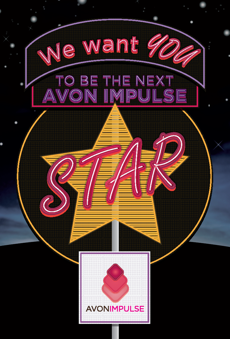
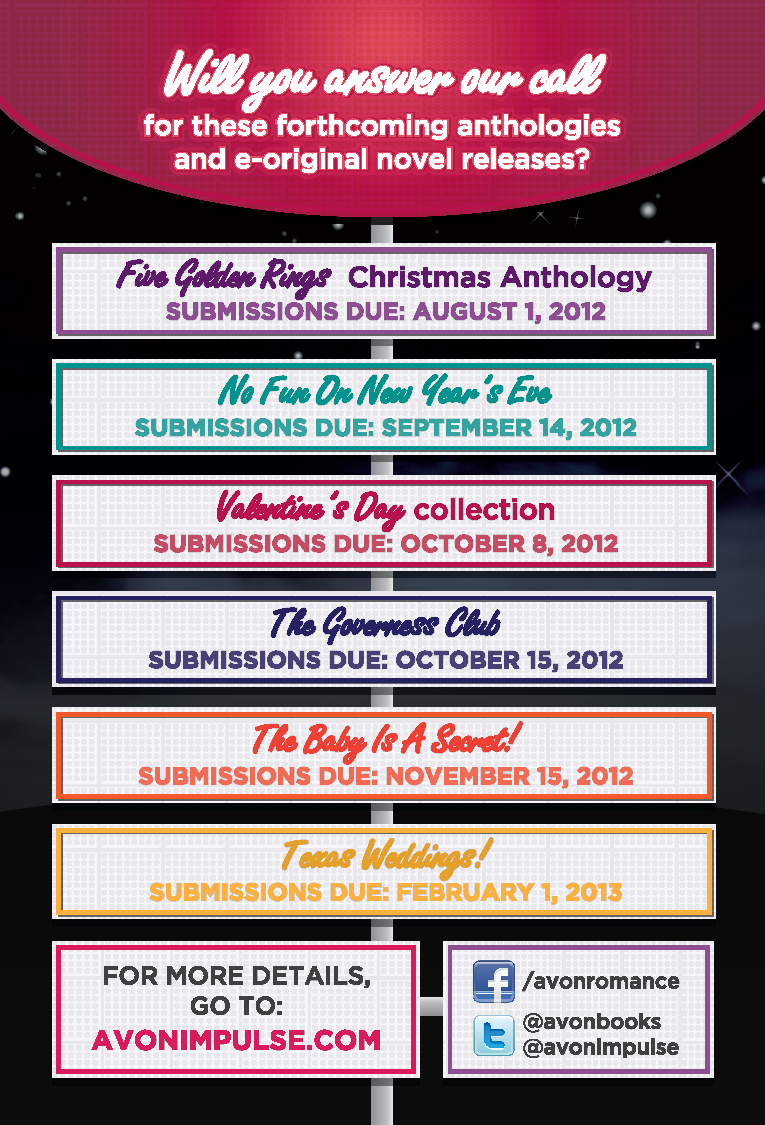
Avon Impulse is an imprint of HarperCollins Publishers, focused on publishing digital books. This imprint specifically holds open calls for manuscript submissions to be considered as a forthcoming author. This postcard was created for distribution at conferences the Avon Marketing team attended in an effort to publicize their open period for submissions.

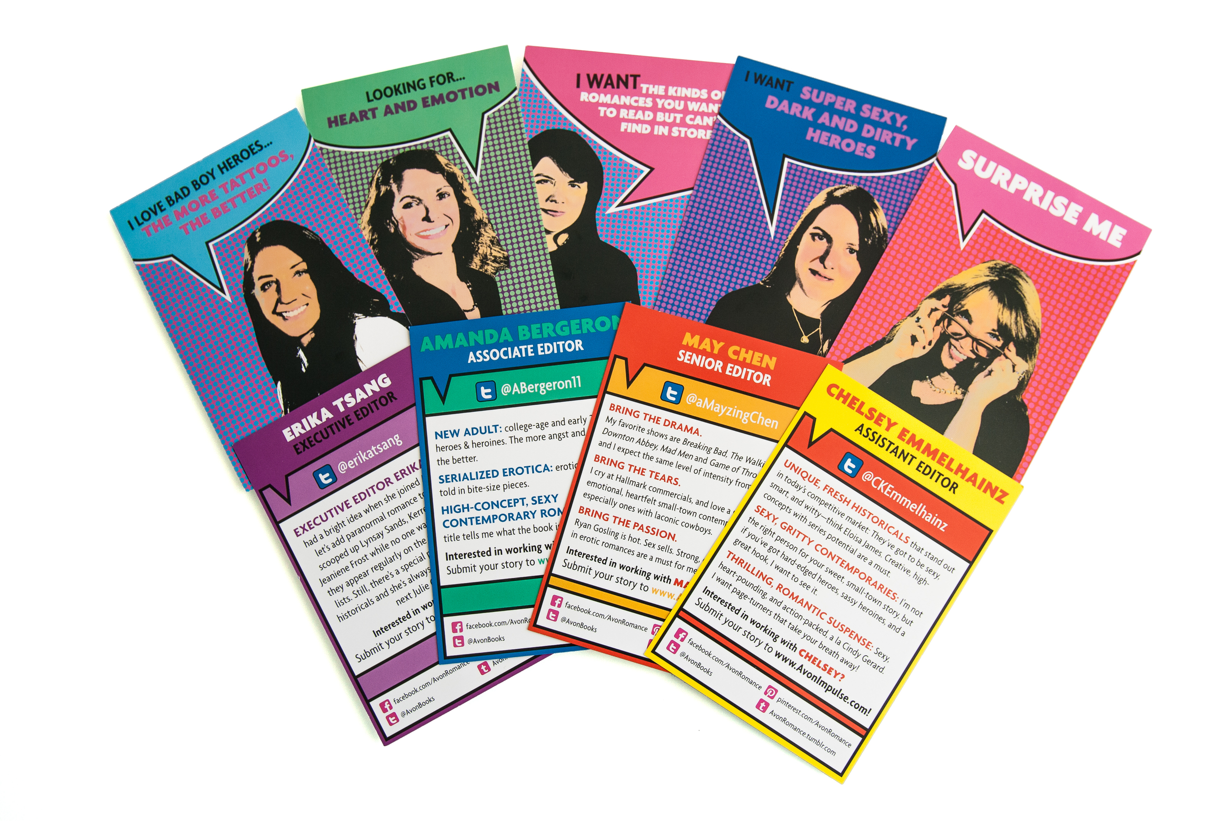
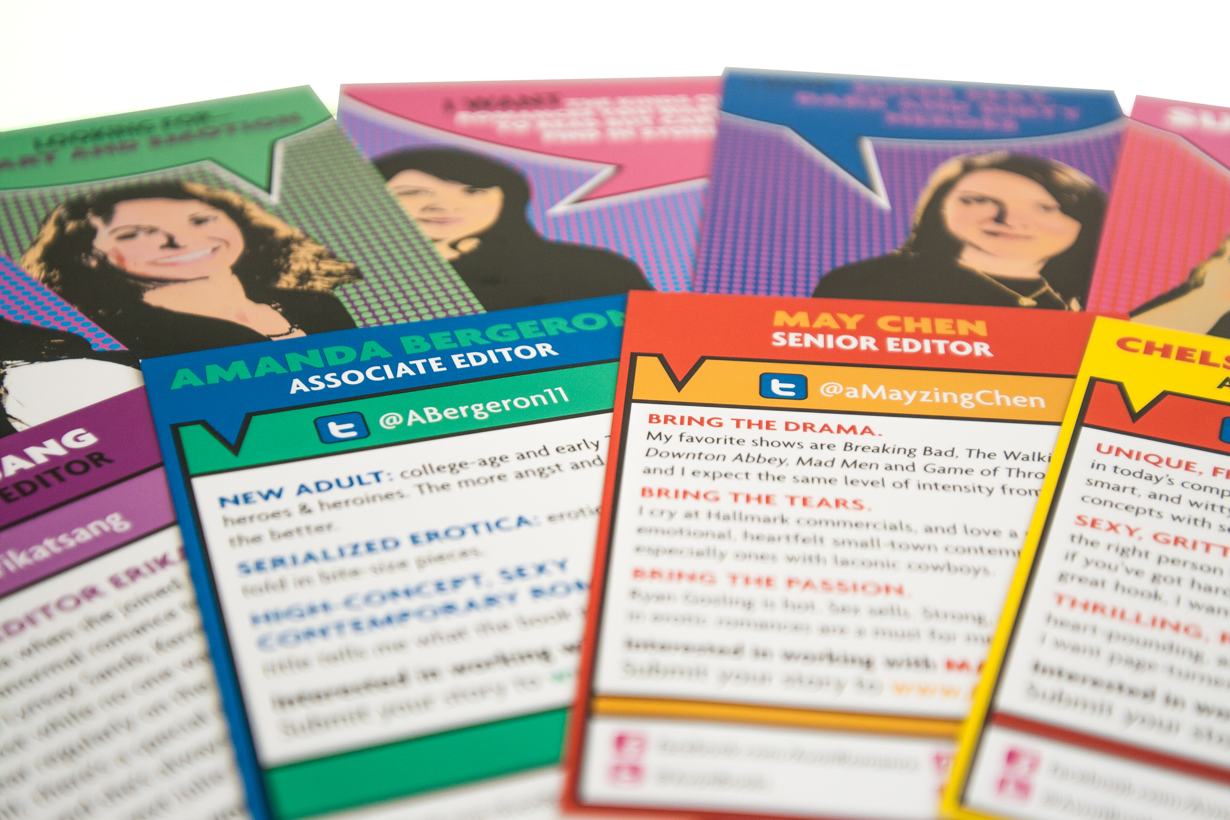
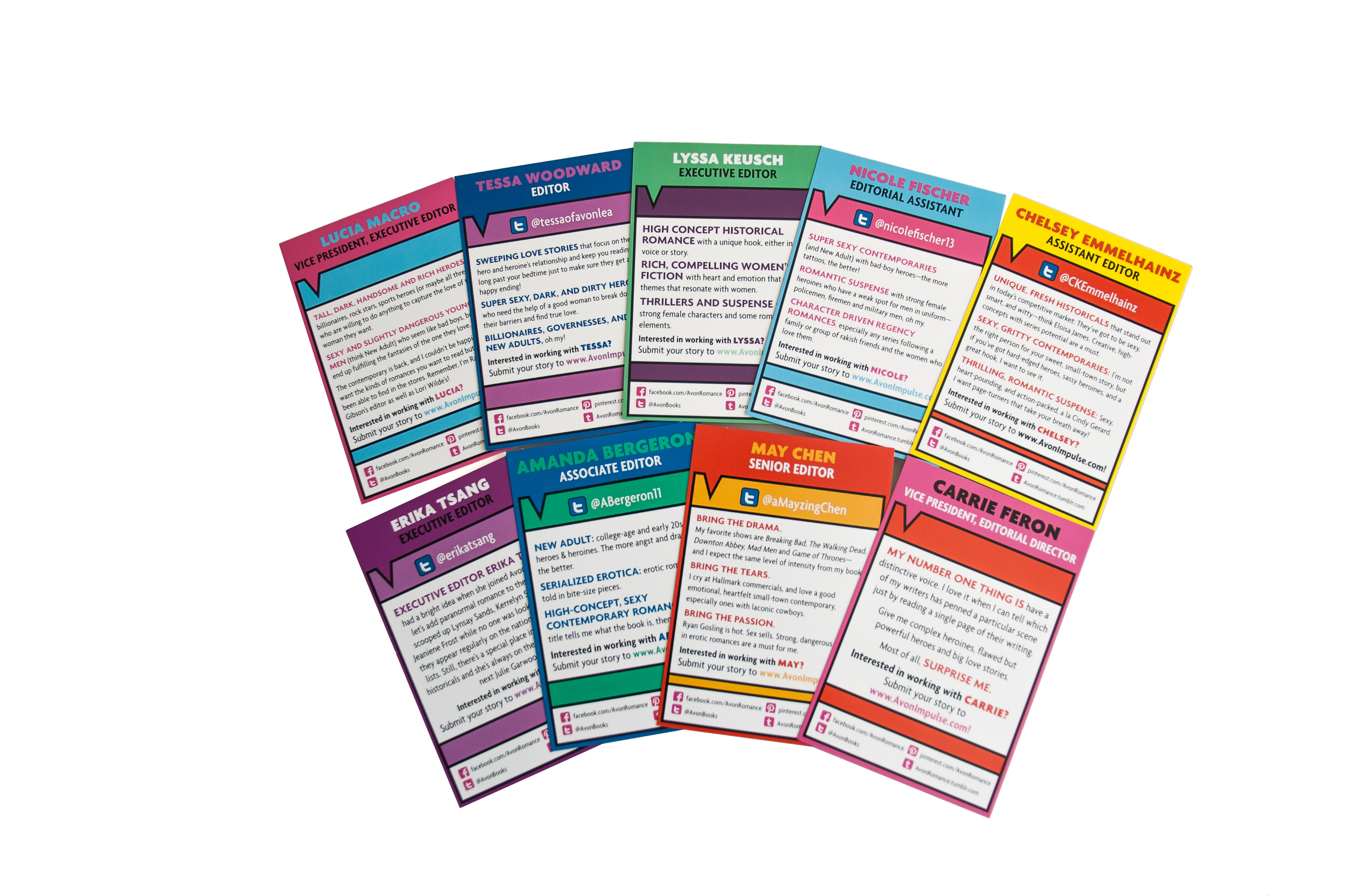
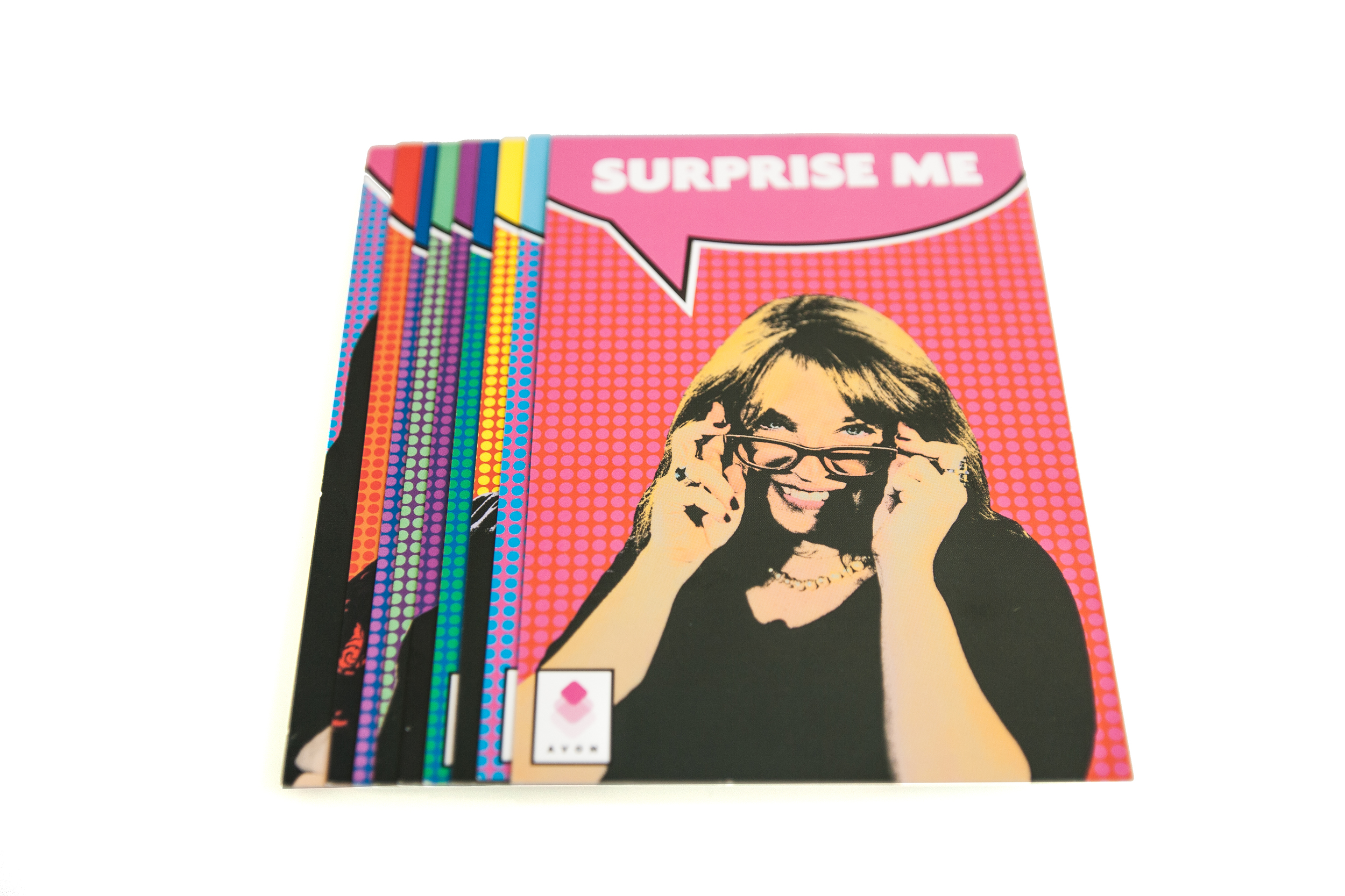
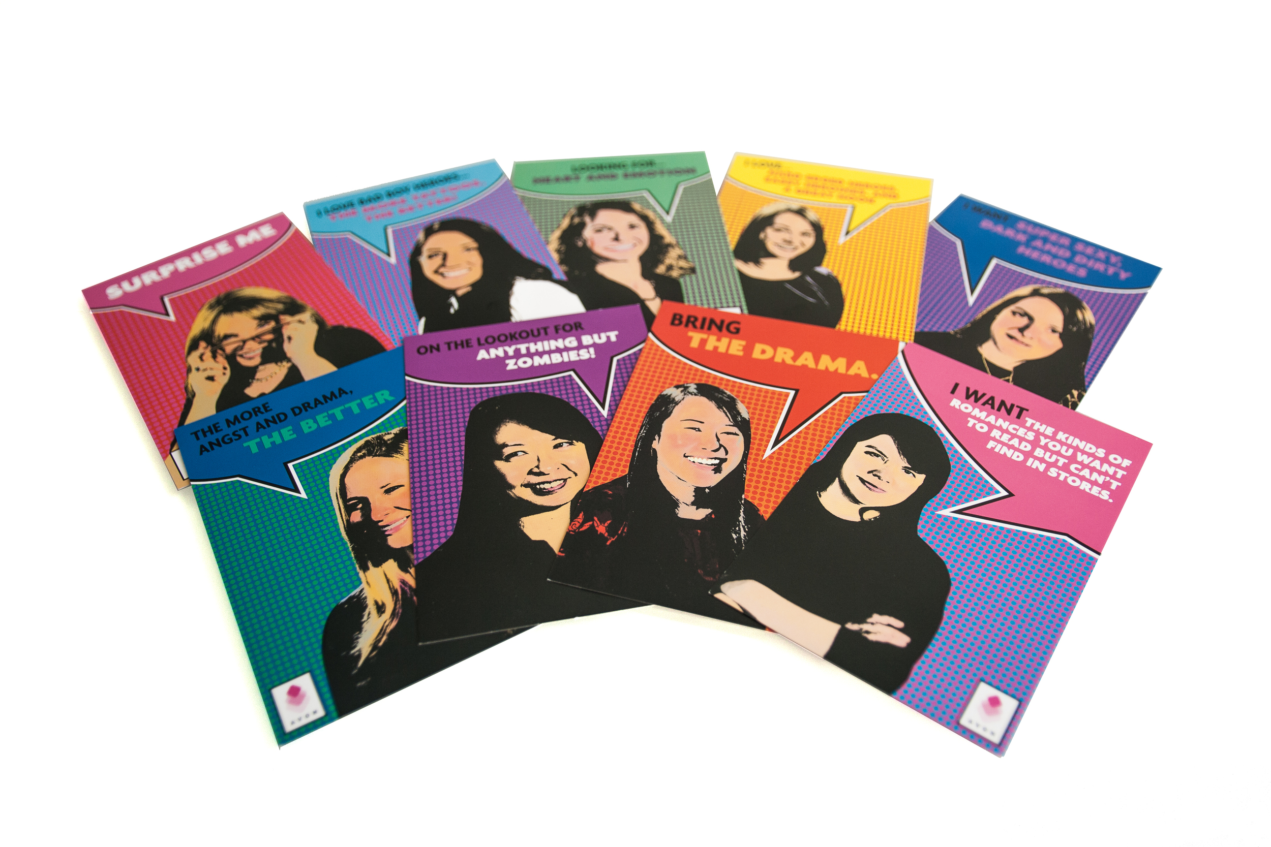
Avon Editor Trading Cards
As another marketing campaign for open calls for manuscripts, Avon Books wished to highlight their editors and what they are looking for in submissions by creating a set of trading cards for the set of editors. Using clean photos taken in the photo studio, a pop-art style was applied to each for a fun 1950's to 1960's vibe. Each editor selected their favorite two colors for inclusion on their card, which was applied to the background as well as the back information. Using a standard template and design approach with a flexible color palette provided variety while still maintaining cohesiveness across the set.
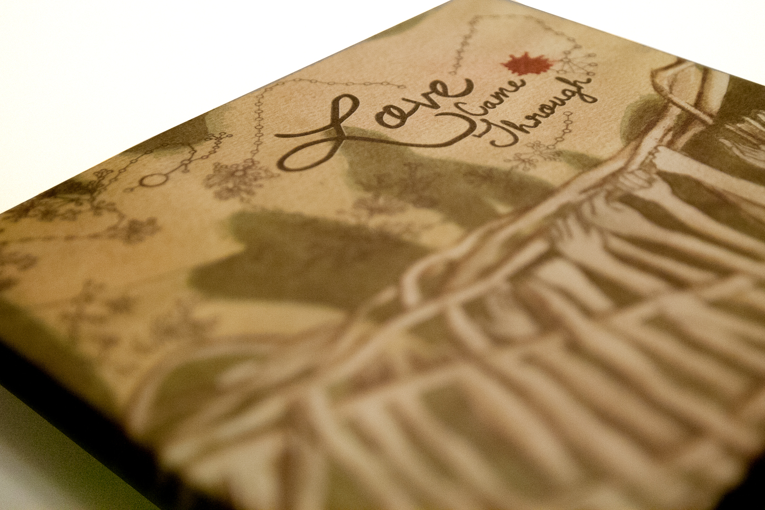
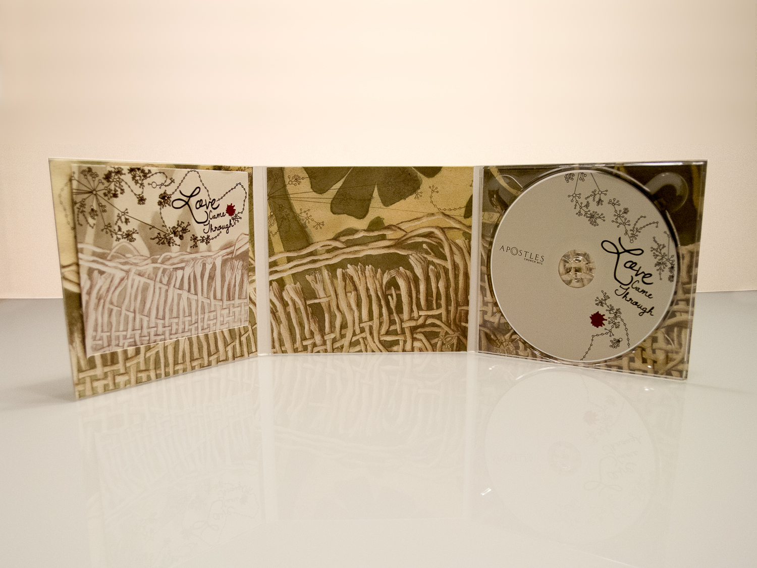
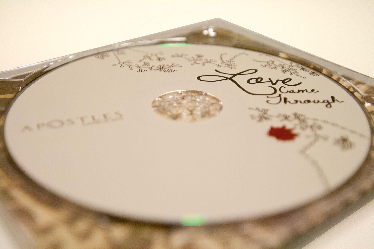
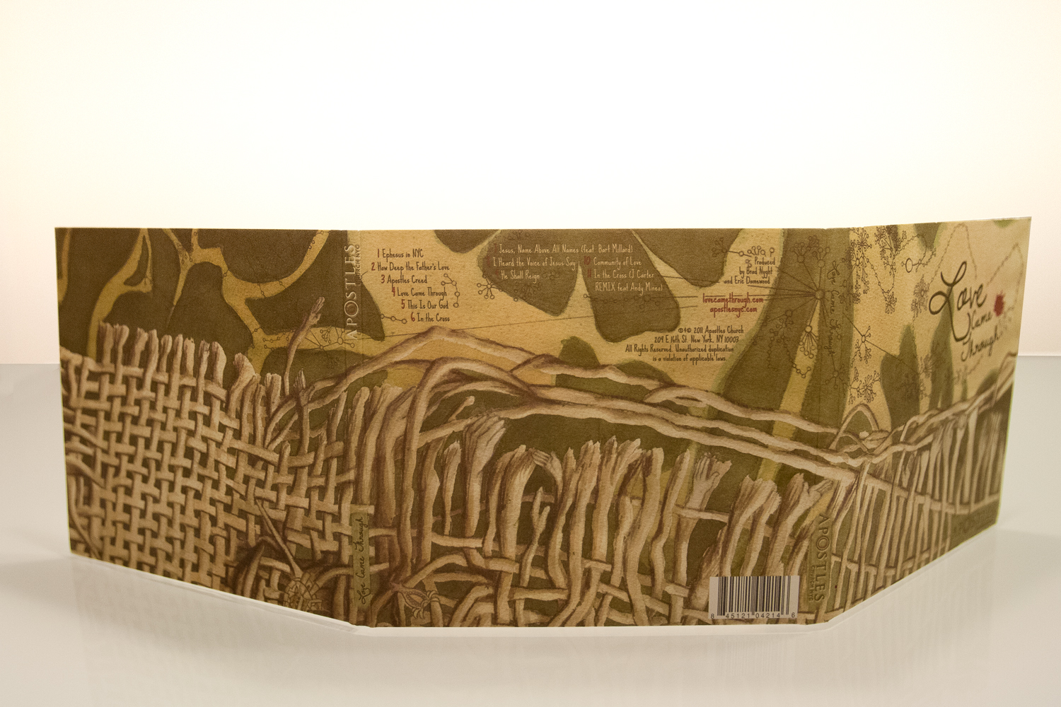
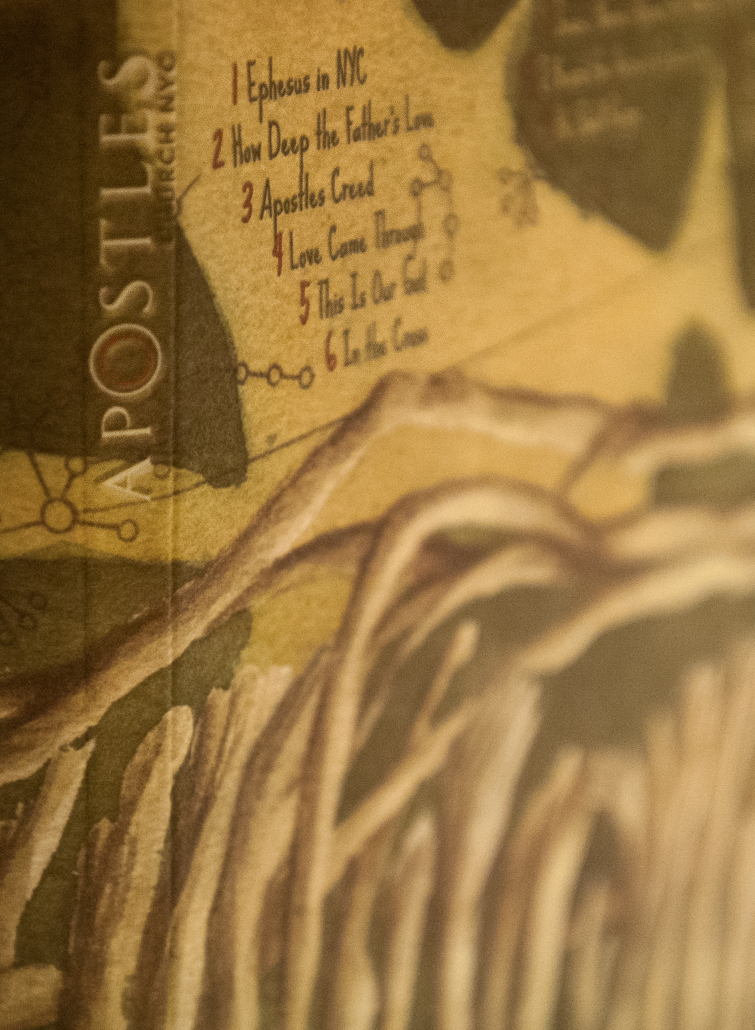
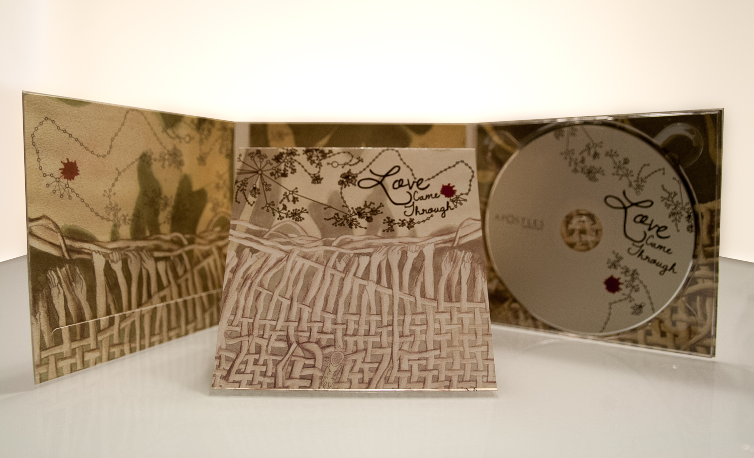
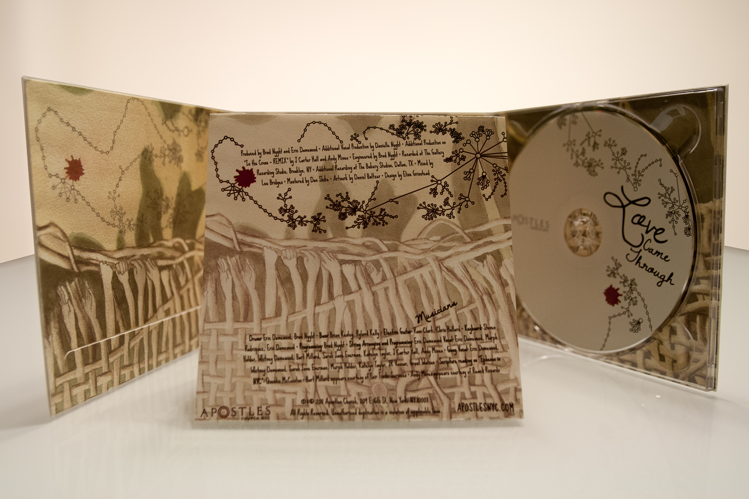
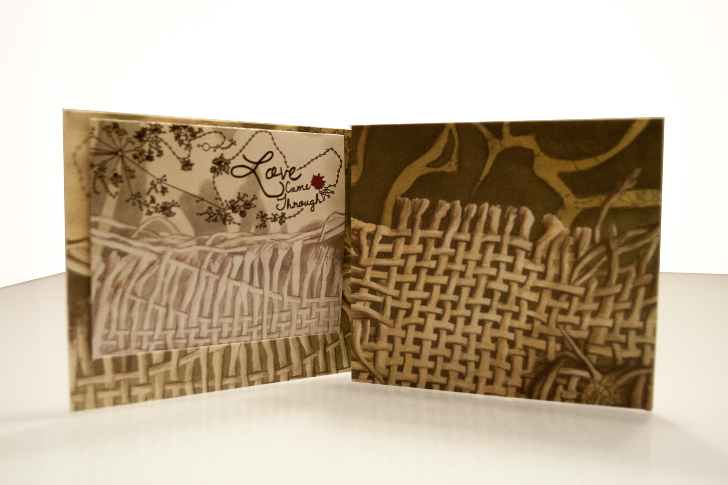
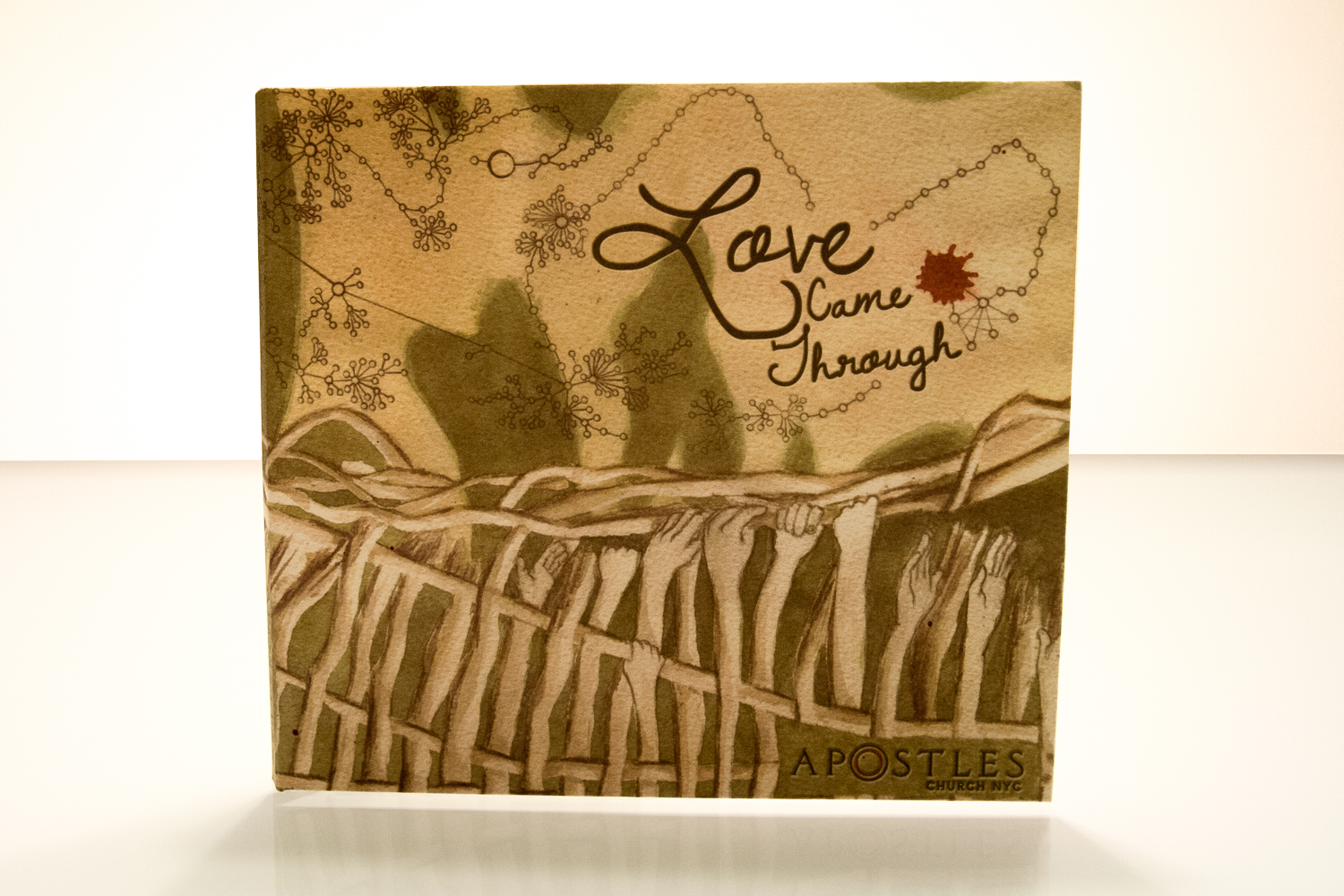
Love Came Through CD Design
Apostles Church NYC produced their own music album in late 2011, titled "Love Came Through." A painter in the church (Daniel Baltzer) created a custom piece for the CD art, but graphics, typography, and overall layout for the final printed piece was needed. Taking from the feel of most of the original lyrics on the album, as well as the watercolor, interwoven artwork, the created graphics needed to convey the sense of being in creation and creating, personal--as if this making of music is a process and it is not finished or polished yet. Typography was carefully selected and elements were pulled from the original artwork to create the finished product.